Ankita Arora

B2C DeNoize Website Redesign
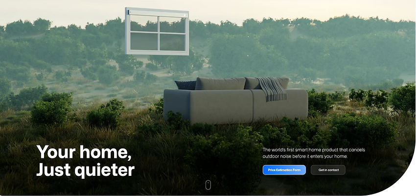
The DeNoize website was originally built in 2018 and needed updated content, a clearer sales funnel, and a more modern experience for our current users.
Founding UX Designer at DeNoize
Client
Role
Founding UX Designer
Tools
Figma, Webflow, FigJam, Adobe Photoshop
Duration
2.5 months
Year
2025

The Challenge


Initial analysis presented to the stakeholders
DeNoize product is the world's first noise cancelling technology. It was important for the potential usrs to understand what this technology does. The current website didn't serve the purpose. When speaking with potential users at events, in interviews, and through informal conversations, a consistent pattern emerged: users struggled to understand the product. This validated my initial analysis presented to the stakeholders.
"What exactly does this product do?"
"How does it look once installed?"
"Will it work with my existing windows?"
"Is it a full window replacement or just the glass?"
"What is Harmony Glass?"


Despite strong product-market potential, the website required too much cognitive effort to understand. Key concepts were unclear, terminology felt technical, and users couldn’t quickly determine whether the solution was relevant to them. This confusion created hesitation, reduced trust, and weakened conversion.
Although the sales funnel in the future is predicted to be via B2B channel, the website was made B2C to build a customer base, spread awareness about the technology, etc.
Key Insights
Users confused product type
Users didn't understand the technical terminology
Users want visual proof before trusting the solution
Pricing uncertainty blocked action
Based on these key insights, I defined four UX goals:
Reduce cognitive load for first-time users
Clarify the value proposition
Increase trust and credibility
Create a guided conversion path
Project Planning

To define the Information Architecture and site hierarchy, I facilitated a series of stakeholder discovery workshops. These sessions were critical for requirement gathering and ensuring cross-functional alignment on the product vision.
Through the stakeholder insights, we developed a prioritization matrix to categorize features based on their feasibility, desirability, and viability. This strategic approach allowed us to define a phased roadmap, focusing on an MVP launch designed to capture early user traffic and validate our core value hypothesis through iterative releases.
Site Map and User Flow


Site Map and User Flow - Phase I of the Website
The user journey moves from
Problem
→
Solution
→
Action
and mirrors a psychological decision sequence
Recognize Needs → Perceive Relevance → Decide to Act
With the new journey defined, I translated it into a simplified information architecture focused on reducing cognitive load and reinforcing a single, clear conversion path. Every content block was intentionally structured to either increase clarity, build trust, or guide users closer to the pricing funnel. Nothing was decorative — each section had a strategic role in supporting decision-making.
Users can make decisions faster and with greater confidence when the choices are limited and minimized
Hick’s Law
Information was broken into digestible sections (headline → benefits → how it works → call-to-action), allowing users to process the value proposition quickly and intuitively.
Reduced Cognitive Load
Strategic use of size, contrast, spacing, and positioning ensures the primary message and call-to-action stand out immediately and guide attention naturally down the page.
Visual Hierarchy
The core offering is introduced upfront, framing how users interpret all subsequent information and setting a strong mental reference point for value.
Anchoring Bias
Related content elements were grouped together to create visual cohesion, helping users instantly understand relationships between ideas without overthinking.
Gestalt Principles
Initial Sketches
Low-fi Wireframes

Wireframes, thought process and content, image references for high-fidelity prototype

Feedback session with stakeholders on wireframes
Prototypes were used to gather feedback on the visual design, information architecture, and how the new documentation was presented to the visitors of the DeNoize website through tools like FigJam and Miro. In feedback sessions, stakeholders could provide their positive feedback and improvements on the designs.
Linear Conversion Path
The user flow breaks the process into three simple steps:
Get a price estimate
Book installation
Enjoy the results
This leverages - Zeigarnik Effect - small and achievable steps
Progressive disclosure -
High-fi Wireframes

Design Outcome
Impact

Statistics of website visitors in one month after release of the website
Next Steps
Phase II implementation


.png)
